Photo: Leafy Sunset 4

Leafy Sunset 4 — green leaves on a sunset of purple and yellow

A lively purple and yellow sky surrounds a branch of vivid green leaves. Dark green and bluish-purple complement each other. I used a flash to light up the branch; the alternative was to silhouette the leaves, but that didn’t look as good here.

I added saturation to the colors, darkened the edges, and increased the contrast.

Fujifilm FinePix A360, 1/70, F2.8, 5.8mm, ISO64, 2006-01-27T17:55:10-05, 2006-01-27_17h55m10

Download the high-res JPEG or download the source image.

This work is licensed under a Creative Commons Attribution 3.0 License. Please credit me as “Photo by Richard Thripp” or something similar.

More of the Leafy Sunset series.

Photo: Leafy Sunset 3

Leafy Sunset 3 — a dark blue and pink sunset with silhouetted leaves and branches

Dark pink clouds and a blue sky, with the silhouettes of leaves and branches in the foreground. Sounds like a leafy sunset to me. The contrast and colors in the sky were beautiful; I hated the branches on the right for a while, but they seem to contain the image nicely.

I added contrast and burned in the top, so the sky goes to a frightening black. :cool:

Fujifilm FinePix A360, 1/52, F2.8, 5.8mm, ISO64, 2006-01-16T18:02:51-05, 2006-01-16_18h02m51

Download the high-res JPEG or download the source image.

This work is licensed under a Creative Commons Attribution 3.0 License. Please credit me as “Photo by Richard Thripp” or something similar.

More of the Leafy Sunset series.

Photo: Leafy Sunset 2

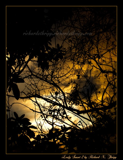
Leafy Sunset 2 — yellow sunset of leaves and vines

Leaves and branches set against a dark yellow sunset. The vines may be distracting, but they have a pattern all their own, which meshes well with the colorful yet ominous sky.

Standard darkening and contrast added through curves here. I had to tone down the colors a bit, as they went out of gamut after the contrast enhancements (that happens often in RGB color spaces).

Fujifilm FinePix A360, 1/63, F4.7, 17.4mm, ISO64, 2006-01-13T17:40:46-05, 2006-01-13_17h40m46

Download the high-res JPEG or download the source image.

This work is licensed under a Creative Commons Attribution 3.0 License. Please credit me as “Photo by Richard Thripp” or something similar.

More of the Leafy Sunset series.

Photo: Leafy Sunset

Leafy Sunset — bright yellow leaves against a serene sunset

Yellow leaves against a blue and pink sky. This is an early piece, re-edited (January 2006). I took generic photos of the sunset, but wanted to experiment with including other elements of nature, which gave way to this. I used the flash to brighten the leaves, which also made the sunset appear darker and more vivid.

I added contrast and moved the colors from orange to pink to make this look good.
[quickshop:4*6 Leafy Sunset (lustre):price:0.95:shipping:0.45:shipping2:0.45:end]

Buy a 4*6 copy for $0.95 (USA only). Lustre finish. After adding, go to your shopping cart.

Fujifilm FinePix A360, 1/30, F2.8, 5.8mm, ISO100, 2006-01-04T17:54:53-05, 2006-01-04_17h54m53

Download the high-res JPEG or download the source image.

This work is licensed under a Creative Commons Attribution 3.0 License. Please credit me as “Photo by Richard Thripp” or something similar.

More of the Leafy Sunset series.

Photo: Illumination

Illumination — a scary face lit up on black

My self portrait. Where there’s light, there’s darkness, and that darkness, surrounds me. I lit this with a bunch of cheap flashlights, using my camera’s timer. This is how I look after journeying into The Night of Eternal and Unrelenting Darkness. They’re really the same photo, if you look closely.

I removed blemishes, darkened a lot and added contrast, burned the edges of my face to make it more round, re-centered my face in the bottom-right third, and finally converted to black and white, with a bit of blue. The XY coordinate (512,332) in the above is RGB (18,16,21) now, where it should be (17,17,17) for black and white, for example. This adds subtle coldness, which is the best type, anyway.
[quickshop:4*6 Illumination (lustre):price:0.95:shipping:0.45:shipping2:0.45:end]

Buy a 4*6 copy for $0.95 (USA only). Lustre finish. After adding, go to your shopping cart.

Canon PowerShot A620, 1/15, F2.8, 7.3mm, ISO50, 2007-01-29T17:19:17-05, 2007-01-29_22h19m14

Download the high-res JPEG or download the source image.

This work is licensed under a Creative Commons Attribution 3.0 License. Please credit me as “Photo by Richard Thripp” or something similar.

LIS and more

I’ve been impressed by the progress the LISWiki (library and information science) has been making, so I’ve opened an account and started contributing to articles; stuff like digitization, renew, checkout, and open stacks.

I’m also blogging about library service now; I wrote my first article yesterday, 10 Tips for Reference Dialogues (digg). If you’ve read my about page, you know librarianship is my choice career, so it’s inevitable I start writing about it. This will be mixed in with my photography here, though there will be more photos of books to accompany my entries.

Other news: the spring ’08 semester is over. I got an A in everything but photography, where I got a B+. Do you see the irony there? I did the assignments and missed no classes, and had nice stuff including Wine Bottles, The Rebel, and The Gaze for my presentation, but my teacher is afraid of A’s.

My cousin’s blogging again. I set up my photography archive using Gallery2, but it’s just for family and friends since my family is afraid of the public. I changed all the Google ads here to orange; I like it because they stand out yet complement the olive green links and banner. 2008-05-16 Update: Switched back; orange was getting no clicks. Check out the “printable view” links on each post now, such as the one for 10 Tips for Reference Dialogues. I messed with the WP-Print code so that the footnote markers come after links instead of before, the printed from URI is just the article, and the links are black instead of the default blue or purple (that’s CSS though). What I don’t like about the defaults, is that links are blue, but if you’ve clicked them (a:visited), they’re purple, and this shows up if you print in color. When you print, they should be all the same. I picked black over blue, so in multi-page articles headlined with a color photo, I can print page one on my color laser and the rest on the monochrome, and there is consistency. When I print stuff out, I use Internet Explorer instead of Firefox, because it formats margins and text nicer.

Also, the print pages don’t say “Brilliant Photography” now, cuz it makes no sense for LIS articles. It’s just richardxthripp.thripp.com now, which is short and sweet.

That’s it for now; thanks for reading.

10 Tips for Reference Dialogues

The reference dialogue: books and a question mark

A cornerstone of library work is the reference interview (or interrogation if you’d prefer), as it is the principle persona for the library knowledge-base, and is increasingly the domain of library assistants and para-professionals. These are the ideas I’ve picked up from working in the public library sector.

1. Use the encyclopedias. Many students come in wanting books on obscure subjects. Especially in smaller libraries, there are no books to be found, but an encyclopedia article will do in a pinch, and is an authoratative source.

2. Ask questions. If he asks where the nonfiction section is, don’t just point at it; ask if there is anything in particular he’s looking for. Often there is, but you need to break the ice. If you’re asked for “history books,” don’t ask interrogative questions like “why do you need history books?,” but cooperative ones like “what kind are you looking for?”

3. Quality over quantity. Don’t give the patron a good book on crocheting and then eight unrelated books on knitting; start with one, and then follow up if the resource proves inadequate. Overloading him with information is not much better than doing nothing at all, as it is our job to sift the wheat from the chaff.

4. Leverage Google for the author of a title, the jargon of a field, or even how to spell an elusive word (if the mis-spelling is common, Google will list it with the question, “did you mean?”). This can be useful if you can’t understand your patron’s mumblings; search what it sounds like, and often you’ll get your answer. You can then query your library’s catalog with the details you found online.

5. Keep it simple. When a patron comes in asking how to search jobs or phone numbers online, be sure to put in a good word for the Pennysaver and phone book; they are often the more relevant choice.

6. Be nice. The theory of participation inequality applies to reference requests too. Though we will never have accurate stats, we can assume that 90% of library users who would like to know about something don’t ask, be it because they lack a definite question, feel uncomfortable, or are just quiet in general. Do you want to drive away the 10% that do ask, or make the 90% grow even larger?

7. Take initiative. If that user is staring quizzically at your biographies, or struggling with your public catalog, ask him if there’s anything you can do to help. Often, this will be the catalyst for a question-and-answer discussion that will bring out what he’s looking for.

8. Defer gracefully. For the many patrons who ask genuine questions, there are a few who will bring page-long lists of items for you to find, or expect super-human expertise from you. Offer to find the items or show them how to use the OPAC (“teach them to fish”), but if there’s a line forming, stay firm that their involved requests must wait.

9. Ask for help. If you’re having trouble finding accounts from the Spanish-American War, ask the resident history buff, or go to a reference librarian or the Internet if need be. No librarian is an island.

10. Follow up. Ask if there’s anything else he wants, or if the information you’ve provided works or is off-target. He may be afraid of being a pest, not realizing the core of the library is patron inquiries. By being open to feedback, you make the public welcome and at ease.

When we strive to be genuinely helpful, we are supporting the perpetual education of our citizens, and the library as the heart of the community.

Continued reading:
The Reference Interview by William C. Robinson
Mock Refernce Interviews by Jimmy Ghaphery
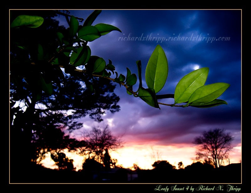
Photo: Liquid Suspension

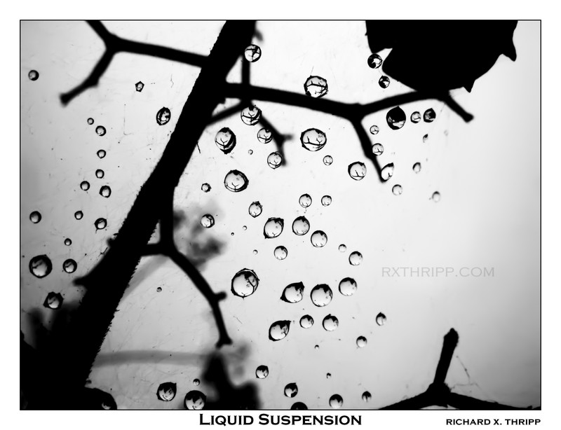
Liquid Suspension — water droplets floating in a spider's web

Tiny raindrops, levitating in a spiderweb. Most people don’t realize it’s a spider’s web, but if you’re observant, you can figure it out from the stray dirt and threads. I shot this in January 2007 with my old Canon A620 (this is the first release here); I focused as close as it would go (one centimeter) for this, as the drops were really tiny. To increase the depth-of-field, I closed down to F7.1 (the range on the A620 is F2.8-F8). I kept taking photos after this, but disturbed the web mistakenly, causing all the drops to fall. This one, while dull at first, came to life with my editing. The reflections in the drops are my favorite element, each representing a microcosm of the world we know and love.

If you haven’t figured it out, spider webs aren’t pretty. There were pieces of dirt and dead bugs strewn in the web. My purpose as an artistic photographer is to present a realistic ideal of the world, through whatever means necessary. My job was to remove those, both from the web and the droplets’ reflections. I only did this in a couple; in the other droplets, I decided that the reflections pass for branches or leaves above or around the web. I used Adobe Photoshop CS2’s spot healing brush and clone stamp to take out the offending elements, while double checking that there were no smudge marks by making the image much darker using the Levels tool, followed by checking the integrity of the highlights. The last step was to crank the contrast into overdrive (curves), because the scene was really dull to start; it was a dreary, overcast day, after all. It all came together in the post-processing stage.
[quickshop:4*6 Liquid Suspension (lustre):price:0.95:shipping:0.45:shipping2:0.45:end]

Buy a 4*6 copy for $0.95 (USA only). Lustre finish. After adding, go to your shopping cart.

Canon PowerShot A620, 1/320, F7.1, 7.3mm, ISO50, 2007-01-18T13:16:43-05, 2007-01-18_18h16m43

Download the high-res JPEG or download the source image.

This work is licensed under a Creative Commons Attribution 3.0 License. Please credit me as “Photo by Richard Thripp” or something similar.

Photo: Speed

Speed — speeding down a city road at night

This is the second-anniversary edition of Speed, a photo I took from the passenger’s seat of a car in motion. We were moving at 30 miles per hour, but with the one-second exposure, the center is sharp but the edges are blurred. While I posted this on deviantART back in May 2006, I’ve added nice orange text, a border, and a bit more contrast to this revised version. The street is Derbyshire Road in Daytona Beach, Florida.

The Call, an English band, put this photo on the cover of their album, Missing Pieces, from October 2007. I enjoy the songs, and though the band broke up last month (April 2008), they will be forever missed.

The photo-shoot for Speed

As you can see above, I took eight photos to get this one. All the others were blurry (camera shake), but I got the highlighted one just right by bracing the camera against the dashboard, and so it became Speed.

Fujifilm FinePix A360, 1″, F2.81, 5.8mm, ISO100, 2006-05-12T20:33:44-04, 2006-05-12_20h33m44

Download the high-res JPEG or download the source image.

This work is licensed under a Creative Commons Attribution 3.0 License. Please credit me as “Photo by Richard Thripp” or something similar.

Photo: Fly Away

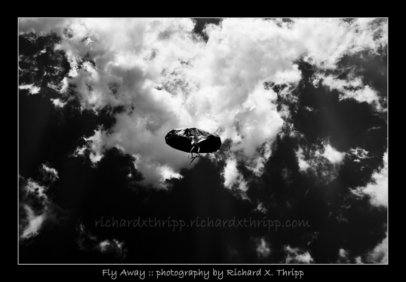
Fly Away — an escaping balloon against an inviting sky

A helium balloon, escaping into the great blue beyond, in black and white. I got this balloon for my sixteenth birthday (2007-08-17), and by nine days later, it still was trying to get away, so I set it free and photographed it. I’ve given out print copies, but this is the first online publication. I hope you enjoy it.

I switched to black and white, cropped out tree branches that snuck into the frame, and made the sky and balloon almost black with the curves function.

[quickshop:4*6 Fly Away (lustre):price:0.95:shipping:0.45:shipping2:0.45:end]

Buy a 4*6 copy for $0.95 (USA only). Lustre finish. After adding, go to your shopping cart.

Canon Rebel XTi, EFS 18-55mm, 1/100, F16, 18mm, ISO100, 2007-08-26T14:52:54-04, 2007-08-26_18h52m54

Download the high-res JPEG or download the source image.

This work is licensed under a Creative Commons Attribution 3.0 License. Please credit me as “Photo by Richard Thripp” or something similar.