Photo: Reach for the Dream

Reach for the Dream — the red ornament

I found this red ornament on the ground while walking with my camera, and was inspired to set it on a nearby tree branch and reach my hand out as a reflection. The ornament represents your dreams, and the hand represents your continued pursuit of them. Don’t give up!

For this, I brightened the ornament while darkening my fingers, added contrast, a blurry glow effect, and stripped the background down to black and white (selective color).

Canon Rebel XTi, EFS 18-55mm, 1/80, F5.6, 55mm, ISO400, 2008-05-12T19:06:17-04, 20080512-230617rxt

Download the high-res JPEG or download the source image.

This work is licensed under a Creative Commons Attribution 3.0 License. Please credit me as “Photo by Richard Thripp” or something similar.

Thripp.com: the blogging network

I’ve slaved hours away on Thripp.com: the blogging network, and it’s now open in a public beta. :grin: Sign up for your spot now. This is great step forward for social blogging, and you can take advantage of the same great scripts I use to multicast this blog to LiveJournal and Xanga. Read on . . .

I wrote this two days ago, but didn’t expect to get rolling so quickly:

People have been signing up for Thripp.com despite my lack of advertising. I’ll work on the layout and features in July. I can’t get virtual subdomains like I want without upgrading to a virtual private server, which I won’t yet pay for, so you just get a name like thripp.com/foobar instead of foobar.thripp.com (which I know you’d prefer). Sorry for that. If you start blogging for some reason, I added plugins you can activate to multicast to Facebook, LiveJournal, Twitter, and Xanga, like I do (see links in my footer). You’ll have to hand over your passwords, but they’re safe with me.

Today, 2008 May 24, it all starts. I’ve established a WordPress MU powered blogging network here at Thripp.com, complete with an integrated community forum (thanks to bbPress), log-in and blog management links right from the side-bar, the same clean design from Brilliant Photography by Richard X. Thripp, RSS links for each blog right in the footer, and PHP scripts that automatically aggregate the latest blogs, comments, and posts. I’ve gone ahead and done it with subdirectories instead of subdomains, but they are no less memorable, especially with the eye-catching Thripp.com name. 14 people have already gotten started, with fascinating blogs like OpinionSource and Wisconsin Mortgage. You can get started immediately, as this is a public beta.

Thripp.com plugins

I’ve even added some great plugins to enrich your blogging experience, which you can activate under “Plugins” on your dashboard, after you sign up, of course. Advanced Category Excluder lets you leave out any categories you pick from the home page, RSS feeds, or archives, with handy check boxes. Top Level Categories cuts out the “/category” part of your category URIs, keeping your addresses short. WP Grins lets your commenters add emoticons with ease, while Wordbook, Twitter Tools, Xanga Cross Post, and LiveJournal Crossposter (under “Settings”) let you automatically and seamlessly broadcast your blogging to Facebook, Twitter, Xanga, and LiveJournal, complete with links back to your original entries at Thripp.com.

Social commenting is actively encouraged. Gone are the Captchas, registration forms, and moderation queues you see on other networks; here anyone can contribute feedback to any post, immediately and with ease. And if you’re against unmoderated commenting, you can go to “Settings > Discussion” and suit your tastes. This is backed with the excellent spam filtering of Akismet, to stop the Viagra ads in their tracks.

This is beta because it hasn’t all been thoroughly tested, and I’m on shared hosting so I don’t know how far I can push the network. Feel free to make a donation to help keep me out of the red. I’m open to any suggestions or feedback; just add them to the comments on this post.

Cheers. Contribute, blog safely, and share alike. I’ll be reading.

Richard's signature

I’m a Gawker Artist!

2008-07-20 Update: They upgraded the site and broke the old URLs! Here’s my new Gawker Artists page.

I have a page on Gawker Artists now. The photo that got me in is The Rebel, one of my favorite portraits, taken for my now-concluded black and white film class. This means the image will appear occasionally on Lifehacker and other exhibitors. Quite cool. Sarah will be proud, if she checks here. She’s representing an entire movement of non-conformity.

The Rebel: a girl smoking in front of a no-smoking sign

I came up with a great summary of my photographic mission for the page:

I’m an experimental photographer who’s been working in the digital medium for four years. I strive to capture nature in inspiring and unusual ways; while I take pretty pictures, they should always make you think. The same effort goes into my portraits and still life; I photograph whatever I like, and am known for forcing people to pose in crazy ways, or for spending hours setting up arrangements of marbles or ketchup bottles. I’m a believer in contributing to the photography community, so I write a lot of behind-the-scenes details and add tips for my fellow photographers to my website.

If you’re a photographer, isn’t that what your mission should be? To make people think. Anyone can do that. Anyone can do what I do. But does that mean you do? For many of you, no. But I’ll do it for you.

In my spare time over the past few days, I’ve been working on the tech side of the site, instead of posting new material (sorry to my viewers). Some advances:

• My Twitter updates are at the bottom of the first post on each page (Twitter tools, with modifications).
• The ads are inline with posts; see the top-right of the first post on any page, and the link ads after the 2nd and 7th posts. That was tough to figure out. Code like “<?php $postnum = 0; if (have_posts()) : while (have_posts()) : $postnum = $postnum; the_post(); ?>” and “<?php $a = 2; $b = 7; . . . ” went into my WordPress template’s index.php file.
• I switched to Google Custom Search for my search engine (in the side-bar). There are extra ads when you search, which I make money on like the normal ads.
• I made the links below the banner nice, and cleaned up the sidebar, moving stuff to an Index page. The cousin and the father have been demoted to there.
• All thumbnail links use Highslide now, so if you have JavaScript enabled, click one and it will pop up right on the page. You can even flip through photos with the arrow keys. This is a big improvement from a plain link to a JPEG file, and was suggested by the author of Post-Thumb revisited, the plugin I’m using to implement and manage it.
• I added a Contact page, with my info and an inline contact form (SCF2 Contact Form).
• I switched over to WP Super Cache, from WP-Cache. After some battling, I thought I had it so every page, except search, the shopping cart, add to cart, and random gallery, was cached and gzipped, from the second visitor every 24 hours onward. I was very proud of it. It worked for a couple hours, but now only some pages are zipped while other, more important ones get nothing, and I have no idea why. I give up, I’ve spend enough time on this. If it’s not good enough for Steve Pavlina, then it’s not good enough for me. I gzipped the larger CSS and JavaScript files while at it (prototype.js is cut from 125KB to 22KB), and that sticks, fortunately.
Comment previewing is gone. I was revising the preview text, and then the text disappeared and I couldn’t get it to work at all, even writing the settings into the database myself. This isn’t an advance; I just gave up. Maybe it’s outdated, I don’t know, but that’s enough dealing with it. If your comment messes up, post a corrective comment, and I’ll fix it and delete the second one for you.
• Added “overflow: hidden” CSS class to the header (with the six random photos). So if you’re browsing in a window smaller than 1024×768, there is no ugly wrapping to the next line.
• I finally hacked WP-Print to put the URI markers after the hypertext instead of before. So now I can print out wonderful articles like How to Brand Your Prints and they can be read logically. If you print (“Printable View” link below any post), do it in Internet Explorer 7. Firefox is no good at formatting in print. Plus, I was sick of the line breaks in my awfully long Amazon.com affiliate links, so I changed the code so there are no line breaks for URIs, and Firefox deals with this by making all the text really small, while Internet Explorer forces a line break (nice).
• People have been signing up for thripp.com despite my lack of advertising. I’ll work on the layout and features in July. I can’t get virtual subdomains like I want without upgrading to a virtual private server, which I won’t yet pay for, so you just get a name like thripp.com/foobar instead of foobar.thripp.com (which I know you’d prefer). Sorry for that. If you start blogging for some reason, I added plugins you can activate to multicast to Facebook, LiveJournal, Twitter, and Xanga, like I do (see links in my footer). You’ll have to hand over your passwords, but they’re safe with me.

It’s good to know when to give up, as I did with a couple of the issues above. I enjoy taking, editing, and writing about my photos more than this stuff, but somehow I get engrossed in tweaking layouts and settings, which is never the most important thing. It was good this time, for the gallery features mainly, but I’ve had my fix, so I can switch back to the important stuff (publishing photos and writing to inspire others).

I also reached a milestone lately; I’m not in the hole anymore. I’ve made $19 from contextual advertising and $2 from print sales, while I only have $16 invested for hosting (till August when I’ll have to pay almost $10 a month). I’m never going away, even if I have to pay $50 a month and lose money. My art and writing must be accessible to the world, forever.

Photo: The Brave Rose

The Brave Rose — a pink rose trapped by a chain-link fence

This is a brave rose, because she’s trapped behind a chain-link fence. I went out for a walk with my camera this morning and spotted this; the rose was right near the fence, so I moved it to be peeking through one of the diamonds. The background was a house and the rest of the fence, but I opened up to F2.5 to blur it almost completely, keeping your focus on the flower.

By only leaving color in the red channel, everything else went black and white. I used subtle coloring on the rose, a glow effect, and added plenty of contrast. To balance the frame and draw the eye toward the center, I darkened everything else with the burn tool, especially toward the edges. This is a good example of how editing can produce a mood, the mood here being one of sadness and reflection, not only from the rose being behind the fence, but from the dark feel I added, and by alienating the subject from its surroundings with selective coloring.

Canon Rebel XTi, EF 50mm 1:1.4, 1/100, F2.5, 50mm, ISO100, 2008-05-17T06:47:05-04, 20080517-104705rxt

Download the high-res JPEG or download the source image.

This work is licensed under a Creative Commons Attribution 3.0 License. Please credit me as “Photo by Richard Thripp” or something similar.

How to Brand Your Prints

the back of a photo, annotated with laser printing

Photos in print are much harder to brand than photos on your website. If your printing in any great quantity, the tedious process of writing out your name, website, and other pertinent information on the flip side becomes insurmountable. Secondly, most photographic papers have a resin-coated backing, which stubbornly refuses any water-based inks. My methods in this article are aimed toward unframed 4*6 prints, as that’s what I deal with myself, but they can be easily applied to other formats. In fact, the fundamentals of permanence at the end are essential to any print medium.

Whether your printing photos for your friends, family, art, or business, it is doubtless that any copies floating about can make convincing advertisements. Your very livelihood is at stake; what can you do to make sure that everyone knows that you are the creator of those photographic masterpieces? Luckily, you do have options.

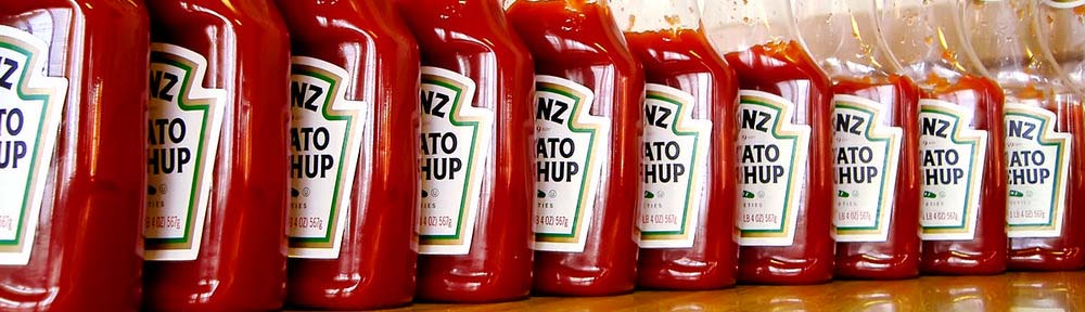
1. Put your name right on the front of the print, straight from the digital source files. This is an easy way to demarcate your work; you don’t have to deal with any hand writing or messy backprinting. Unfortunately, it’s a bit distracting, and anything more than the title and your name is pushing it; include your website and the text will get more attention than the photo. Plus, if you’re going to put the info anywhere, it’ll have to be at the edge of the print, perhaps in a border surrounding the image. You’re going to have to deal with the bleed edge, and it’s a pain because what looks fine on the screen will often get cut off in a borderless print. This becomes especially important if you’re out-sourcing to a lab, as they often crop tightly, and you have less control than with home printing. Nonetheless, as long as you use a big enough border, this is effective, especially if you’re drop-shipping your prints and can’t intercept them to label the backs elegantly. I’m using this very technique for The Freedom Project, my free print offering; the image area is 5×3.34 instead of 6×4, and the extra space is used for a border, with the title and my name at the bottom.

2. Label the back of the print by hand. This is fine in low volume, and provides a connection to your audience. There are downsides though: it’s slow and eats away at your time, your handwriting won’t be as readable as printed type, and getting the ink to stay without damaging the print is a challenge. Don’t even think of using a ballpoint pen; the point will leave a noticeable impression on the front side, and if the ink is water-based, it’s not going to adhere anyway. Your best choice is a pigment-based permanent marker; a Sharpie or equivalent. Ultra fine point is good, as long as you don’t press down too hard.

3. Rely on your lab to label your prints. Usually, they print a tiny dot-matrix label, including the file name or custom text. Winkflash prints the file name, and SmugMug offers custom text, for example. Both are limited to about forty characters—hardly enough space for your name and website. This post by dogwood at the Digital Grin forum sums it up:

Just my two cents, the backprinting option is a GREAT idea… though in reality, it does look pretty poor. The printing is tiny, there are frequent errors, you can’t use symbols (including the copyright symbol), and it looks like one of those 1980’s dot matrix printers is used to create the text.

The provided backprinting is a step up from nothing, though.

4. Label the back of the print with a rubber stamp. You’ll run into the same problem as above: dye or water based inks will never dry. Your only choice is pigment-based or permanent ink, which are less common and more expensive. It’s hard to clean either off your stamps, and the former has the con of not being permanent. Read more here: Ink Pad Basics. Look into alcohol based inks if you pick this route, as they will stick to even plastic.

5. Label the back of the print with an ink-jet printer. This won’t work at all. Trust me, I’ve tried it. It’ll come out looking fine, but as soon as you touch the ink, it smears all over the place, even if it’s sat out for two weeks. It’s fine if you’re using double-sided paper, but if you are, you don’t need to read this anyway.

6. Label the back of the print with a laser printer. Now we’re getting somewhere. This is what I do for all my 4*6 prints using a Lexmark E450dn; the opening image is an example. This won’t work with many printers, and has some problems. For starters, many laser printers get too hot and will damage the finish or curl your prints permanently. Don’t expect any specs on this from the manufacturer. You run the risk that the plastic in the print will melt and get caught up on the rollers, immobilizing your expensive machine. This happens more often with inkjet photo paper, which isn’t designed to stand up to heat. And many printers don’t like to label 4*6’s; you’ll have trouble setting up the tray, and getting the print to be centered. The upside is if it works, you have a cheap and fast way to batch label prints, even with lengthy annotations that fill up the whole back side, like in my example image. The “ink” will always stick, because it’s in fact toner, ground up particles of plastic, which are burned to the paper with a fuser as hot as 400 degrees (Fahrenheit). I lose about one in two-hundred prints, because the printer messes up and crinkles them. But I can run a stack of seventy-five through in eight minutes, usually with no intervention, provided their all the same photo.

7. Use water-based ink, but cover it with a piece of scotch tape. The ink smears a bit under the tape, but remains legible. This looks really ugly. It works, but leaves a bad impression, so I don’t recommend it. Another downside is that the tape may peel with time or under wear.

8. Use printer labels. Get a pack of 2000 clear inkjet labels (just over a cent each), then print on them with your inkjet printer. The ink will absorb into the label, and then you can just stick the label on your print. This is a good method because it overcomes the problems of the prints’ non-absorbent surface, but applying the labels is more time consuming than printing directly as in method five, stick-on labels don’t look as good, and they’re expensive. Plus, they can be easily peeled off.

9. Give up and do nothing. No, no, you can’t do this. Moving on . . .

Now that you know how to do it, the next question is what to do. By do, I mean write. Pick facts to stand the test of time. Your name is a good start, but unless it’s terribly unique (like mine), you’ll want a bit more information so people can track you down—not to stalk you, but so they can buy more of your work and commission you to take photos of their children and pets. Put your website on the back, but be wary that a URI like http://www.flickr.com/photos/richardxthripp/ doesn’t inspire much confidence. It isn’t good for you either—what if Flickr bans you for some unjust reason, or you get tired of the limitations and want to move out on your own? All the photos you’ve labeled and distributed are going to be out of date. Fortunately, you can have the best of both worlds; register your permanent domain for about $10 a year, then set it up to forward to your Flickr account (or SmugMug, or deviantART, or whatever). Any good registrar will offer forwarding, and then if you change photo services or start using your own domain, you can change the settings. All your photos and t-shirts you’ve printed will never go out-of-date, because they’ll be forwarded to the right place as you so smartly set up.

Regarding permanence of information, the same applies to phone numbers. While your number may be better relegated to a business card than to the backprinting on a print, either way, get one you can stick with. You can’t count on your parents or roommates to forever take your calls, but a good solution, if you don’t mind a new number, is GrandCentral, a free proxy phone service with voice mail, multicast forwarding, and other perks. I use this for the 510-936-2417 phone number I bandy about on my contact page and elsewhere, yet it forwards to both my secret home and cell phone numbers, simultaneously. When I change numbers, I just update the record at the website, and start receiving calls at the new number, even though I’m still using 510-936-2417. Since Google has acquired the service, it should remain free and reliable for a long time. You have to sign up for a waiting list, but when I did it, I was chosen in about a day.

So now that you have your shiny, permanent web address and phone number, what else do your fans have to know about their beloved artist? It’s debated, but I feel that every great photo deserves an equally wonderful title, and if there’s anything your print viewers should know, it’s the title of the gem which has entered their collection. Flaunt it proudly on the label. It’s the first thing on mine. An index number is a good idea, so if you’re called for reprints, you can look up the photo by number right away. If each of your photos has a unique title like with mine, I suggest skipping it, however.

Now, what not to write. Unless it’s photo-journalism, don’t write the date. Photos like my Raindrops are timeless, but if I announce that it is from two years ago, people will think it’s old and not valuable, especially when I want to pass it off, implicitly, as recent work. Put the name of your photography studio if you run it, but not if you’re an employee, unless your employer requires it. I have an aversion to “copyright” and “all rights reserved” for backprinting. It’s a waste of ink, your work is copyrighted regardless in the U.S.A., and it won’t deter any thieves. Going with this theme, don’t watermark prints, ever. Even if you’re giving them out. It’s bad karma. Besides, a scanned print won’t be near the quality of your master files.

Do write some notes, if you’re labeling with an efficient laser printer. I do this on a lot of my pieces now, and my friends enjoy reading of the method behind my creative madness. Sign a few prints with a blue Sharpie, so it’s not mistaken for a facsimile signature; they might be collectors’ items someday. Put your website down, but don’t think of detailing your pricing or photography services; people can contact you if they’re interested, and that information is perishable anyway. Whatever you print, make sure it’s big and readable. I use Arial, size 14 for my branding, size permitting, so even blurry-visioned folks can read the title without glasses.

I do hope I’ve helped you in tackling this issue. Marking your prints is a major step toward developing your personal photographic brand, and the virtues of the printed format continue to complement Internet publication. May your followers never wonder who you are, and may your contributions shine through the photography community.

Dynamic Galleries and Random Images for WordPress Photoblogs

I was looking for ways to optimize my website . . . to make it quicker and easier for me to maintain and update, while being fun to browse for my visitors. The problem with the old gallery and random photos at the top of each page, was that I had to make the thumbnails and update the page and database for both (I was using the this randomizer plugin for WordPress), each time I added a photo. It was good because I’d crop, scale down, and sharpen each image to look its best, but the extra work was too much. I found the Post Thumb plugin is the perfect solution. I installed it, set it to make 100×70 thumbnails, and then added this code to my blog header:

<?php the_random_thumb(“link=p&limit=5&category=8”); >

That makes it show five random photos from the category for my photos, linking to the page for each instead of the file. The great thing here is that the thumbnail folder and accompanying MySQL table is updated automatically, so photos are added to the pool as soon as I publish them. A random photos section is good for the casual browser, who just looks at what catches his eye.

Next, I wanted to create a dynamic gallery and random image page. I added the Exec-PHP plugin so I could use PHP code in pages and posts, but found that WordPress inserts a line break between each thumbnail, against my wishes. For that, I added this modified version of Text Control by Jeff Minard, then setting it to not auto-format the gallery and random pages.

The code for page one of the gallery is:

<?php the_recent_thumbs(“subfolder=g&width=200&height=160&link=p&limit=60&category=8”); ?>

and for page two:

<?php the_recent_thumbs(“subfolder=g&width=200&height=160&link=p&limit=60&offset=60&category=8”); ?>

The parameters with all the ampersands tell the script to make 200×160 thumbnails instead of the default, to save them in a subfolder named “g” (for gallery of course), to link to the posts the photos are in, to display sixty thumbnails per page from category 8 (my photos), and, on the second, “offset=60” means to start with photo #61 (computer programming languages count from zero). When I get over 120 photos (I’m at 83 now), I’ll have to make page three manually. I don’t mind that, since mine is a low-volume photo-blog focusing on quality, so I’ll only need to make a new page every few months. I’m stoked enough by what can be done without my help.

Next up was the random page:

<?php the_random_thumb(“subfolder=g&width=200&height=160&link=p&limit=24&category=8”); ?>

This is almost the same as the first gallery page; the function is the_random_thumb instead of the_recent_thumbs, and I reduced the number of photos from 60 to 24. It worked great, except the random photos would not be refreshed on each visit to the page. The problem was the caching module I use, WP-Cache, so I solved it by adding “/random” to the list of rejected URIs in its settings. Unfortunately, this makes the random page the most computationally expensive on the site, which is especially a concern because I’m on cheap, shared hosting. I’ll keep an eye on it, and if it gets too popular and things start crashing, I’ll reduce the number of images or pull the plug.

As if this wasn’t enough, I had another feature to add: a link to a random photo for sale in my expensive shop (powered by YAK), at the top of the sidebar on each page. After doing the above, this was easy:

<?php the_random_thumb(“subfolder=s&width=128&height=86&link=p&category=389”); ?>

This time, there is just one thumbnail per page, so “limit=” is omitted (it defaults to 1). The subfolder for the thumbnails is “s” for shop; you can make the subfolder’s name longer, but I’m keeping it short for simplicity. The width and height are different to match the size of my sidebar , and the category is #389, to show only posts from my shop for framed prints. I’m letting WP-Cache in place, but it clears every day (a.k.a. 86400 seconds), so each page will show a different print each day.

Is that enough? No, Post Thumb isn’t done helping me. I normally create the thumbnails and HTML code showing them for each photo, but the plugin can take care of that automagically. I made these choices in the settings:

Alakhnor's Post Thumb auto-thumbnail settings

For the screen capture of the settings you see above, I added the rel=”nothumb” tag after the alt text, because it’s 475 pixels wide, so resizing to 400 isn’t needed. But I’ll be letting it auto-thumbnail most of the time. For Sunrays 3, for example, I would normally make a thumbnail, upload it, and write this HTML for the post:

<a href=”http://thripp.com/files/photos/sunrays-3.jpg” title=”Sunrays 3 — orange rays of sunshine pierce black clouds”><img src=”http://thripp.com/files/photos/sunrays-3-sm.jpg” alt=”Sunrays 3 — orange rays of sunshine pierce black clouds” /></a>

But now, I write this:

<img src=”http://thripp.com/files/photos/sunrays-3.jpg” alt=”Sunrays 3 — orange rays of sunshine pierce black clouds” />

. . . and the plugin resizes and saves the photo, uses the new version as the image, links to the full-size version, and specifies my alt text as the hover title, while showing the abbreviated code when I return to edit the post. And this is all done before sending it off to LiveJournal and Xanga (with LiveJournal Crossposter and Xanga Crosspost). Very cool, and better than what WordPress does out of the box.

Post Thumb finds the first image in a post, then using a thumbnail of it to represent that post. Since I only put one photo to an entry, it’s perfect in my case. I have both the convenience of a photo-blog and the versatility of a text blog. I can write text articles like this one right alongside my photos, both show up to my RSS and email subscribers, and I can include lengthy descriptions for my photos, while WordPress and Post Thumb do the heavy lifting to compile a detailed blog and minimalist gallery. This is more than can be said for WordPress 2.5’s built-in galleries, or the add-on solutions. It is much preferable for teaching galleries like my own, with lots of text and information accompanying images, than for people who just want to put up scads of photos with no details. I use Gallery2 for the scads of photos (my gallery is private). WordPress and Post Thumb bridge the gap.

While I was at it, I switched default fonts on the site from Lucide Grande to Arial, because it’s included with Windows, and renders better at small sizes in Firefox. I also changed the banner from olive green to a powerful black. The last step was to add links to the new gallery pages below the banner. Changes are good.

Photo: Sunrays 3

Sunrays 3 — orange rays of sunshine pierce black clouds

Orange sunrays emerge from the black clouds. This is from the car like the second; we passed an open field where I had the chance to snap this. I like how the beams are shining down instead of up like you see normally, and the patterns of light and dark in the clouds and between the sunshine were quite a sight.

Added a lot of contrast here, and brightened the sunrays quite a bit, while darkening the spaces in between, to make them more compelling. I wanted the surrounding clouds and land to be black, but I was careful not to over-expose the bright clouds, so they still have detail. This is the kind of editing I enjoy; I’m glad there were no poles and trees to remove like in Pink and Purple Sunset 3. The ones in the bottom-right get to stay because I like them and they’re small.
[quickshop:4*6 Sunrays 3 (lustre):price:0.95:shipping:0.45:shipping2:0.45:end]

Buy a 4*6 copy for $0.95 (USA only). Lustre finish. After adding, go to your shopping cart.

Canon Rebel XTi, EFS 18-55mm, 1/1000, F5.6, 55mm, ISO100, 2007-10-30T17:21:20-04, 2007-10-30_21h21m20

Download the high-res JPEG or download the source image.

This work is licensed under a Creative Commons Attribution 3.0 License. Please credit me as “Photo by Richard Thripp” or something similar.

More of the Sunrays series.

Photo: Sunrays 2

Sunrays 2 — blue beams of sunshine pierce the clouds

An awesome blue sunset. I saw this while my Dad was driving, so I started snapping photos with a fast shutter speed out the window. By luck, I got the timing just right on this frame, including an interesting white fence and some nice palm trees.

I wanted the fence to stand out, as it matched the white rays well, so I dodged it in Photoshop. Then, I added color and contrast with the curves function, and brightened the sunrays. To color the text with the title and my name, I cropped a portion of the photo, stretched it to the size of the text, added a lot of contrast, and then set it as the fill pattern in PhotoFiltre Studio (I use it for text and borders, because it’s much more intuitive than Photoshop).
[quickshop:4*6 Sunrays 2 (lustre):price:0.95:shipping:0.45:shipping2:0.45:end]

Buy a 4*6 copy for $0.95 (USA only). Lustre finish. After adding, go to your shopping cart.

Canon PowerShot A620, 1/640, F2.8, 7.3mm, ISO100, 2007-04-14T19:28:00-04, 2007-04-14_23h28m00

Download the high-res JPEG or download the source image.

This work is licensed under a Creative Commons Attribution 3.0 License. Please credit me as “Photo by Richard Thripp” or something similar.

More of the Sunrays series.

Photo: Blue Marbles 6: Infinity

Blue Marbles 6: Infinity — armies of marbles converge at eternity

These marbles go to infinity, but not beyond it, because they have proper boundaries… sort of. The two rows of three marbles are diverging, though your mind has to work to decide if they are parallel or otherwise. This represents infinity because it makes you think, or so I hope. I did a lot of trials positioning the marbles; this proved to hold my interest the best. The day’s light was good, helping me to get the dramatic mix of black and blue.

I enhanced the contrast, and used Photoshop’s spot healing brush on the mess of specks that are permanently affixed to my subjects.
[quickshop:4*6 Blue Marbles 6: Infinity (lustre):price:0.95:shipping:0.45:shipping2:0.45:end]

Buy a 4*6 copy for $0.95 (USA only). Lustre finish. After adding, go to your shopping cart.

Canon PowerShot A620, 1/15, F7.1, 7.3mm, ISO50, 2007-01-18T14:11:46-05, 2007-01-18_19h11m46

Download the high-res JPEG or download the source image.

This work is licensed under a Creative Commons Attribution 3.0 License. Please credit me as “Photo by Richard Thripp” or something similar.

More of the Blue Marbles series.