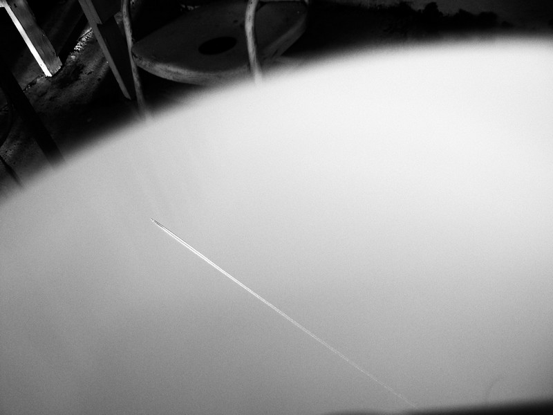
Tag Archive: conceptual

In bizarro world, everything looks like this…
Alternate title: Fun at the Cemetery.
Dad and I stopped off at the cemetery to take photos. I didn’t find the tombstones as interesting as this white railing near the pond, though. From this vantage point, the center crossbeams and the beams of the railing on the other side of the walkway line up, but the ones on the left and right are divergent. An interesting effect.
The railing also appears to be slanted, or maybe I tilted the camera a little. Nothing seemed level in this cemetery. I had to watch …
... CONTINUE READING

Holes in the red-brick wall, by the theater (bldg. 220) at Daytona State College. They made the wall like this because it looks interesting.
I converted this to black and white because the color wasn’t working. The repeating pattern plays tricks on your eyes, if you look at it long enough.
For editing, all I had to do was add contrast and vignetting. The image isn’t perfectly level, but it’s as close as I could get, and I got complete holes on the sides which makes the image aesthetically stronger (because they’re dark).
Think of this wall as …
... CONTINUE READING

Sarah (another Sarah) pretending to eat a blue light bulb. No animals were involved in the creation of that light bulb. The light bulb is a perfect vegetarian snack.
You can’t see that the light bulb is blue, because I converted this to black and white. It makes more sense that way.
Sarah has some nice teeth. Eating a light bulb is probably a bad idea, at least as far as her teeth are concerned.
If you want to be more like Sarah, read Becoming a Vegetarian.
Canon Rebel XTi, EF 50mm 1:1.4, 1/160, F3.5, 50mm, ISO100, 2008-10-01T15:55:18-04, 20081001-195518rxt

Looking up through a basketball hoop.
I tried thinking of a more abstract title, but nothing is better than “Basketball Hoop.” Sure, if this were a plain, ordinary photo of a basketball hoop, a creative title might add some jazz, but when the photo is creative on it’s own, a mundane title is a good contrast. A creative title would work too, but a mundane title for a creative piece is far better than an unfitting creative title.
I took this at F2.5, so even parts of the netting are out of focus. The background was a dull …
... CONTINUE READING

A car with yellow headlights illuminates the road on a dark, cloudy evening.
This car had lights that were unusually colored. I bet they had a yellow filter over them, but they looked brighter than normal too.
For editing, I decided to go with really warm colors, much more so than the actual scene. It gives a better mood than bluish tones. Also, I dodged the ground to make it look like the headlights are brighter, while adding contrast and burning the corners to make the scene more eye-catching. Because I shot this at ISO400, I brought …
... CONTINUE READING

This is what it feels like to live in the fog all the time. Took this of some green traffic lights at night. How did I get the fog? I blew on the lens, and the condensation made the photo turn out like this, no fog required.
I added a ton of contrast, burned in the sides, and switched to black and white. The added contrast amplified the noise considerably, so this is a noisy image. It works because of the lack of color, though.
Canon Rebel XTi, EF 50mm 1:1.4, …
... CONTINUE READING