Photo: The Sibling Flowers

The Sibling Flowers — A red flower and a white flower together

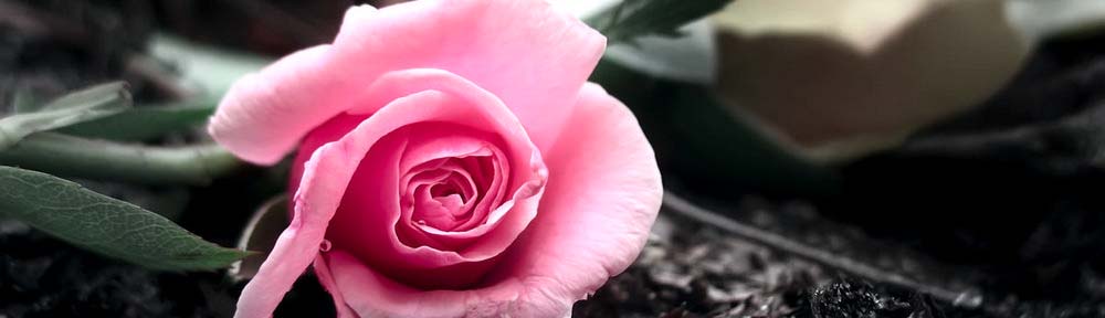
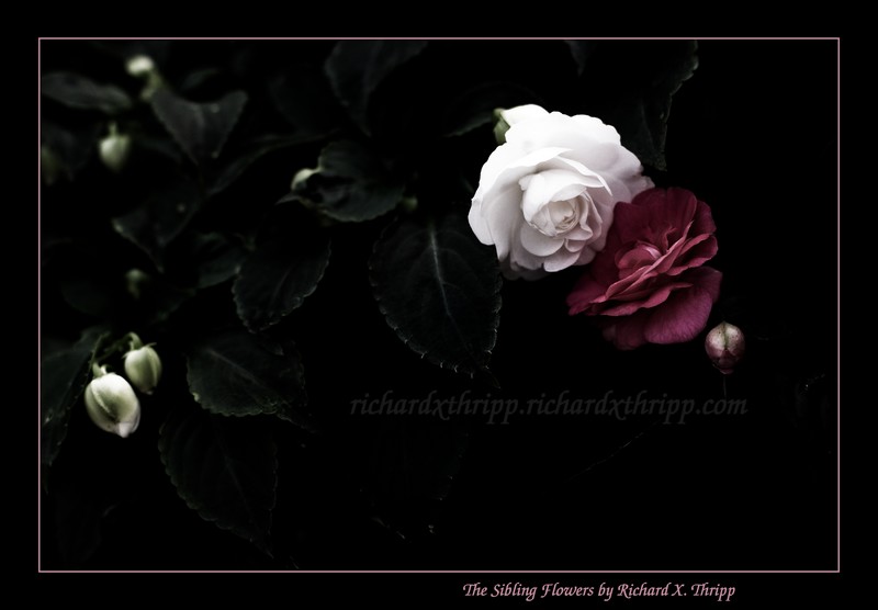
A pair of flowers; one white, one deep red. I shot this at the garden section at Wal-Mart; the flowers were already close together, but I moved them closer. It’s a good combination. I got as close as my lens would focus to cut out the background.

I under-exposed compared to my camera’s meter on purpose, as it was blowing out the whites in the auto-exposure mode. In Photoshop, I desaturated everything, but left color in the red flower and a bit of green in the leaves. I didn’t go all the way to black and white, as I feel the green adds to the mood. Then, it was just a matter of darkening everything and adding in some contrast. I also cloned out distracting highlights at the top and burned the corners slightly.

Canon Rebel XTi, EF 50mm 1:1.4, 1/125, F3.5, 50mm, ISO400, 2008-05-04T18:54:55-04, 20080504-225455rxt

Download the high-res JPEG or download the source image.

This work is licensed under a Creative Commons Attribution 3.0 License. Please credit me as “Photo by Richard Thripp” or something similar.

Photo: The Sky’s Mirror

The Sky's Mirror — blue raindrops from a stormy sky, on a glossy window

These raindrops were on the back window of a friend’s car, after the rain (appropriately). This was as close as I could get with my 50mm lens; I put the focus right in the center, so it fades out toward the edges. I liking how the reflections of light and clouds in the background turned out. You can see an outline of each drop on the underside of the window below, which is also interesting.

This is the spiritual successor of The Sky’s Ceiling and possibly Crystal Rain; check them out to see how my ideas are evolving.

The blue colors were largely fabricated. I darkened the photo and added contrast for effect.

Canon Rebel XTi, EF 50mm 1:1.4, 1/400, F2.8, 50mm, ISO100, 2008-05-22T17:05:05-04, 20080522-210505rxt

Download the high-res JPEG or download the source image.

This work is licensed under a Creative Commons Attribution 3.0 License. Please credit me as “Photo by Richard Thripp” or something similar.

Photo: Color and Light

Color and Light — the morning sun shines on refrigerator magnets

These are magnets that are holding up 4*6 copies of my photos on the refrigerator. The sun shines through the window in the morning, lighting them up like this. I didn’t notice it before (not usually up in the mornings), but I had to snap this when I saw it.

I toned down the blue channel while adding to the red channel, and darkened a bit.

Canon Rebel XTi, EFS 18-55mm, 1/50, F5.6, 55mm, ISO400, 2008-05-30T07:39:13-04, 20080530-113913rxt

Download the high-res JPEG or download the source image.

This work is licensed under a Creative Commons Attribution 3.0 License. Please credit me as “Photo by Richard Thripp” or something similar.

Photo: Reach for the Dream

Reach for the Dream — the red ornament

I found this red ornament on the ground while walking with my camera, and was inspired to set it on a nearby tree branch and reach my hand out as a reflection. The ornament represents your dreams, and the hand represents your continued pursuit of them. Don’t give up!

For this, I brightened the ornament while darkening my fingers, added contrast, a blurry glow effect, and stripped the background down to black and white (selective color).

Canon Rebel XTi, EFS 18-55mm, 1/80, F5.6, 55mm, ISO400, 2008-05-12T19:06:17-04, 20080512-230617rxt

Download the high-res JPEG or download the source image.

This work is licensed under a Creative Commons Attribution 3.0 License. Please credit me as “Photo by Richard Thripp” or something similar.

Photo: The Brave Rose

The Brave Rose — a pink rose trapped by a chain-link fence

This is a brave rose, because she’s trapped behind a chain-link fence. I went out for a walk with my camera this morning and spotted this; the rose was right near the fence, so I moved it to be peeking through one of the diamonds. The background was a house and the rest of the fence, but I opened up to F2.5 to blur it almost completely, keeping your focus on the flower.

By only leaving color in the red channel, everything else went black and white. I used subtle coloring on the rose, a glow effect, and added plenty of contrast. To balance the frame and draw the eye toward the center, I darkened everything else with the burn tool, especially toward the edges. This is a good example of how editing can produce a mood, the mood here being one of sadness and reflection, not only from the rose being behind the fence, but from the dark feel I added, and by alienating the subject from its surroundings with selective coloring.

Canon Rebel XTi, EF 50mm 1:1.4, 1/100, F2.5, 50mm, ISO100, 2008-05-17T06:47:05-04, 20080517-104705rxt

Download the high-res JPEG or download the source image.

This work is licensed under a Creative Commons Attribution 3.0 License. Please credit me as “Photo by Richard Thripp” or something similar.

Photo: Blue Marbles 6: Infinity

Blue Marbles 6: Infinity — armies of marbles converge at eternity

These marbles go to infinity, but not beyond it, because they have proper boundaries… sort of. The two rows of three marbles are diverging, though your mind has to work to decide if they are parallel or otherwise. This represents infinity because it makes you think, or so I hope. I did a lot of trials positioning the marbles; this proved to hold my interest the best. The day’s light was good, helping me to get the dramatic mix of black and blue.

I enhanced the contrast, and used Photoshop’s spot healing brush on the mess of specks that are permanently affixed to my subjects.
[quickshop:4*6 Blue Marbles 6: Infinity (lustre):price:0.95:shipping:0.45:shipping2:0.45:end]

Buy a 4*6 copy for $0.95 (USA only). Lustre finish. After adding, go to your shopping cart.

Canon PowerShot A620, 1/15, F7.1, 7.3mm, ISO50, 2007-01-18T14:11:46-05, 2007-01-18_19h11m46

Download the high-res JPEG or download the source image.

This work is licensed under a Creative Commons Attribution 3.0 License. Please credit me as “Photo by Richard Thripp” or something similar.

More of the Blue Marbles series.

Photo: Blue Marbles 5: Diagonal Bias

Blue Marbles 5: Diagonal Bias — a line of marbles, turned to the side

This, following the first, is the best in the series. I got really close here, so you can see the terrifying details of the marbles. This also gives very shallow depth of field, so the ones far back become quite blurry. Turning the camera to the side is another stab at creative composition, but I mainly did it to keep the edges of the yellow table out of the frame. The blue colors in this one turned out perfect; not too dark nor too bright.

How come I didn’t notice all the dust and hairs on the lead marble when I shot this? It was a pain in the neck to remove, but after that, all I had to do was add a splash of light and color.
[quickshop:4*6 Blue Marbles 5: Diagonal Bias (lustre):price:0.95:shipping:0.45:shipping2:0.45:end]

Buy a 4*6 copy for $0.95 (USA only). Lustre finish. After adding, go to your shopping cart.

Canon PowerShot A620, 1/3, F2.8, 7.3mm, ISO50, 2006-12-22T16:49:43-05, 2006-12-22_16h49m43

Download the high-res JPEG or download the source image.

This work is licensed under a Creative Commons Attribution 3.0 License. Please credit me as “Photo by Richard Thripp” or something similar.

More of the Blue Marbles series.

Photo: Blue Marbles 3: Smiley

Blue Marbles 3: Smiley — marble art: a smiling face

This is marble art! I made a smiley face out of a bunch of dark blue marbles. Amusingly, I ran short and used some light blue, translucent marbles at the bottom. This is on a yellow table outside; it was a challenging shoot because the wind swept through and blew the marbles away a couple times. I persevered to compose and capture this, fortunately.

I added contrast through curves, removed the worst dirt specks on the table, and cloned out the umbrella pole that was at the top-left. I’m experimenting with vignetting here: I made the left corners darker, and the right corners brighter, inspired from the less overt gradations in the original photo.

Fujifilm FinePix A360, 1/119, F2.81, 5.8mm, ISO64, 2006-03-30T15:01:54-05, 2006-03-30_15h01m54

Download the high-res JPEG or download the source image.

This work is licensed under a Creative Commons Attribution 3.0 License. Please credit me as “Photo by Richard Thripp” or something similar.

More of the Blue Marbles series.

Photo: Blue Marbles 2: Darkness

Blue Marbles 2: Darkness — stacks of marbles, with a touch of purple and black

The dark marbles, with traces of black and purple. This has colder lighting. The stacked marbles contribute to an interesting composition, as does the stray line in the background. I picked marbles that were cracked and weathered, to oppose the smooth perfection of the first photo. This is a sub-par entry in the series because the purples are ugly and without detail, but it’s been in the series for two years so it’s worthy of staying. This new edit is an improvement over the two-year old original.

I set tungsten white balance on this, over-exposing the blues horribly. I had no concept of color back in early 2006, and because this is from a low-end JPEG only camera, the detail is unrecoverable. In the new version above, I darkened the marbles, desaturated the clipped blue hues and cloned in the color of the dark marbles, giving purple, and added contrast. It’s a big step up from the original.

Fujifilm FinePix A360, 1/8, F2.81, 5.8mm, ISO100, 2006-03-21T06:46:32-05, 2006-03-21_06h46m32

Download the high-res JPEG or download the source image.

This work is licensed under a Creative Commons Attribution 3.0 License. Please credit me as “Photo by Richard Thripp” or something similar.

More of the Blue Marbles series.

Photo: Blue Marbles

Blue Marbles — shiny spheres in a line

The definitive photo of blue marbles. These marbles are my grandmother’s, and the yellow table I arranged them on is on her veranda. I get to take creative shots of them like this, of course. :grin: 
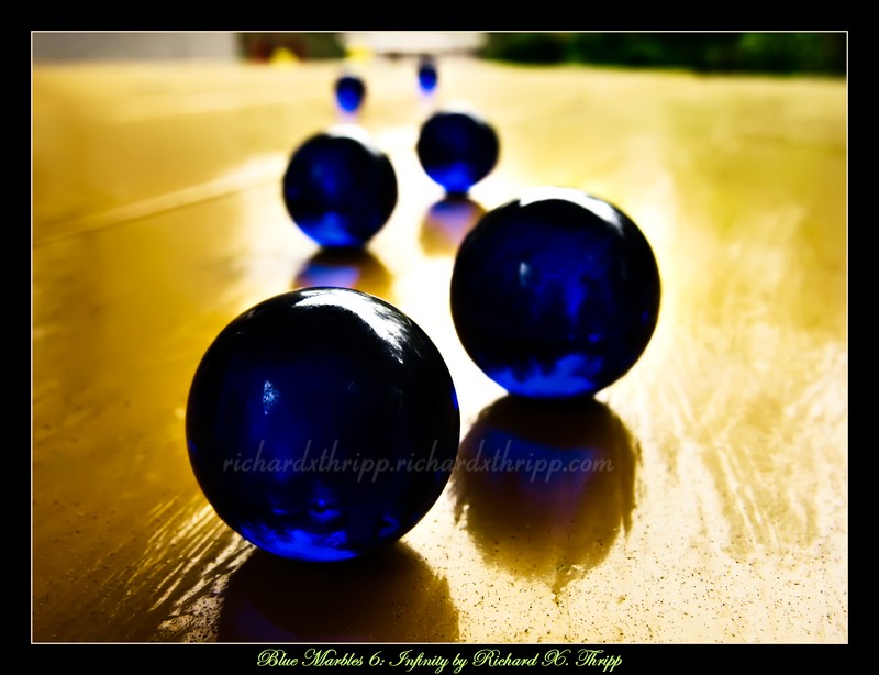
The evening light was just right, and while I originally intended to focus on the first marble, having the focus on the second is more nonconforming and gives a sense of depth. I went back into Photoshop today to revamp this February 2006 piece; my editing skills have improved, so I’m finding the above version especially likable.

I added contrast, removed color, and darkened the edges. Unfortunately the blues clip where the light is shining through the marbles, but I toned the colors down anyway, since subtlety is better than garishness, and because the brighter colors look bad in print. There was some dirt on the marbles and table I had to clone out, as always, but I left some on the table so it doesn’t look overly perfect. The finishing touches were to desaturate the yellow hues slightly, and to sharpen and brighten the second marble while blurring the rest of the image. The camera I was using at the time (a Fujifilm FinePix A360) would only focus to 2.4 inches; I got too close so the first one is blurry. I’m liking the depth of field in retrospect, as it seems like the natural choice with the further emphasis of the second marble.
[quickshop:4*6 Blue Marbles (lustre):price:0.95:shipping:0.45:shipping2:0.45:end]

Buy a 4*6 copy for $0.95 (USA only). Lustre finish. After adding, go to your shopping cart.

Fujifilm FinePix A360, 1/63, F2.8, 5.8mm, ISO64, 2006-02-22T17:49:43-05, 2006-02-22_17h49m43

Download the high-res JPEG or download the source image.

This work is licensed under a Creative Commons Attribution 3.0 License. Please credit me as “Photo by Richard Thripp” or something similar.

More of the Blue Marbles series.