

This, following the first, is the best in the series. I got really close here, so you can see the terrifying details of the marbles. This also gives very shallow depth of field, so the ones far back become quite blurry. Turning the camera to the side is another stab at creative composition, but I mainly did it to keep the edges of the yellow table out of the frame. The blue colors in this one turned out perfect; not too dark nor too bright.
How come I didn’t notice all the dust and hairs on the lead marble when I shot this? It was a pain in the neck to remove, but after that, all I had to do was add a splash of light and color.
[quickshop:4*6 Blue Marbles 5: Diagonal Bias (lustre):price:0.95:shipping:0.45:shipping2:0.45:end]
Buy a 4*6 copy for $0.95 (USA only). Lustre finish. After adding, go to your shopping cart.
Canon PowerShot A620, 1/3, F2.8, 7.3mm, ISO50, 2006-12-22T16:49:43-05, 2006-12-22_16h49m43
Download the high-res JPEG or download the source image.
This work is licensed under a Creative Commons Attribution 3.0 License. Please credit me as “Photo by Richard Thripp” or something similar.


 The evening light was just right, and while I originally intended to focus on the first marble, having the focus on the second is more nonconforming and gives a sense of depth. I went back into Photoshop today to revamp this February 2006 piece; my editing skills have improved, so I’m finding the above version especially likable.


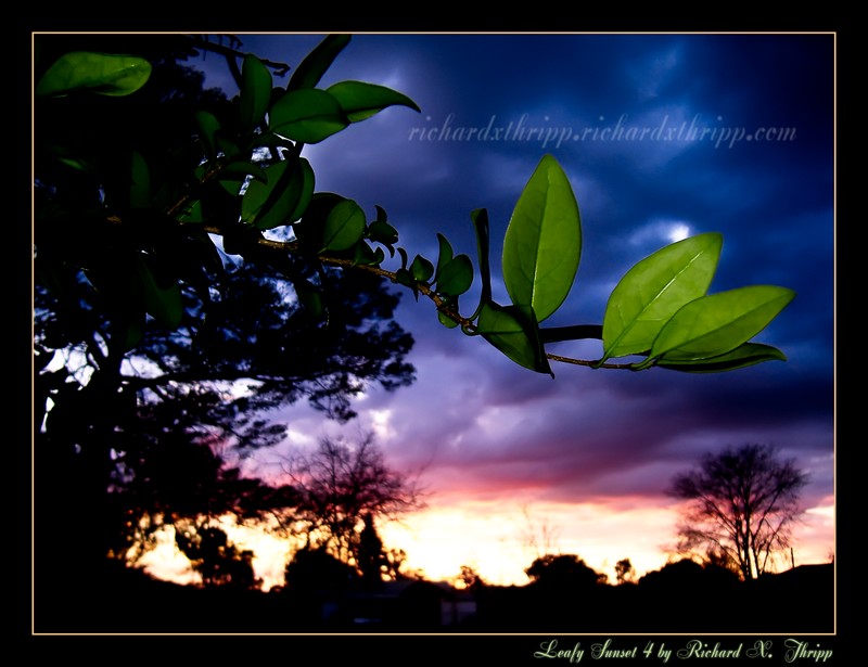
 There are even some raindrops on the leaves, left over from the storms earlier that day. I didn’t notice those till way after the shoot. This is the best of the
