
I was reading this article about Google’s favicon revisions. I don’t like the new lowercase “g”; the old capital one was better and more distinctive. But Google doesn’t like the new icon either, and is accepting submissions, which ends on the 2008-06-20. I always liked the Google logo with the colored balls, but I don’t see any trace of it in their current ideas. so I made and submitted my own:
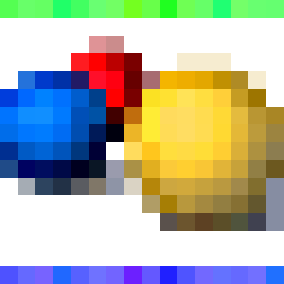
Marissa and Micheal complain that Google has no specific logo, so only their name or a derivative of it will do. Why can’t this be their logo? It’s already on Google Earth (at the bottom-left). Seems like a good favicon idea to me. The speckled green and red bars frame the balls, representing the Google spirit of courage and innovation.
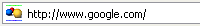
If it wins, here’s what my Firefox address bar will be looking like in a few weeks:
And this will be the new Google browsing experience:
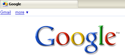
Beautiful, no? I like it a lot better than what we have now:
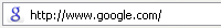
The problem with the small g, is that it doesn’t look like the home page’s logo, the color doesn’t match, it’s indistinct, it’s too formal, it’s no fun, it isn’t memorable, it’s confusing, and it isn’t Google. I’m hoping my icon is Google. If only they’ll listen.
Your Google balls is very similar with the icon of DownloadHelper (a Firefox add ons but in different colors)
Ooh, didn’t know that; they’re even the same color. Google ought to be fine using this, since they’ve had the logo since before DownloadHelper. Check it out at the bottom left on their TOS page (direct link). I adapted it from that.