The five chapters in your adventure:
1. an introduction to stock photography [1]
2. taking the photos [2]
3. nitty-gritty editing [3]
4. how to pitch a model release [4]
5. building effective keywords [5]
Stock photography is not art photography. If you’re looking to express your creative spirit while making a comfortable living, this is not the place for you. You can do the latter with work, but not the former, because stock images are boring as salt.
Curiously, the best stock photos are interesting. Crafting a photo that is not boring yet appeals to advertisers is a lot harder than creating a whole bunch of boring photos and making it on volume. I don’t know how to do the interesting, successful ones, but they usually involve people shaking hands or flying kites at the beach. In this article, I’ll be introducing you to the technical details that will help you to create boring stock photos. Then you can move up to better ones later. If you don’t learn these basics, your great ones will look slightly imperfect and won’t sell (read: won’t be accepted by your microstock agency), which we can’t have.
Most people elbowing their way into the stock world start with the microstock networks, because they’re the only shot for an average Joe to make any sort of money. Ones like iStockphoto [6], Shutterstock [7], fotolia [8], and Big Stock Photo [9]. These websites let up upload your photos, which they then sell to their customers, taking much of the profits but giving you a commission (something like twenty-five cents per sale). They’ll only take stuff they think will sell, and only if the image is “perfect”: grain-free and plastic looking, six or more megapixels, no artifacts (if you have a cheap camera, this is impossible), and other requirements. If you’ve tried going out on your own, you know how hard it is to get viewers, let alone customers (I have enough trouble giving my photos way [10]), but you’ll get guaranteed traffic at these sites, just as you’ll get more visitors to your MySpace page than to your Geocities page (sorry for the outdated examples).
In microstock, you have to make it on volume, because you’re giving non-exclusive, royalty-free rights cheaply. The good thing is you have the potential to build a passive income, if people continue to buy your photos after you’ve posted them. If you’re fairly good, you can expect to make a few dollars a year per photo, which will snowball with your tireless work and hundreds of contributions.
Stock agencies are really crazy about noise (a synonym for grain). They’ll reject photos for any sort of grain, even if it’s artistic. DSLRs produce less grain because of their larger sensors, but images, even in broad daylight, will be often be rejected if they’re done on digital compacts, because they have smaller sensors and produce lots of noise all the time.
The best you can do in-camera is to use the lowest ISO speed setting, as this has the lowest light sensitivity and produces the least grain. If your photos are blurry because your shutter speed is too slow, add more spotlights or get a tripod to keep the camera steady.
Enough about noise, onto your subjects. A good subject is people, making business deals, doing things, vacationing with family, surrounded by palm trees, at the beach, pretending to be happy, etc. Too many people focus just on still life, because they’re too shy to scout for models and ask them to sign the necessary forms. It isn’t that hard, though.
Take pictures of your family! You still have to get them to sign forms, but they may be a good start for you to build up your portfolio, and you have access to them all the time. For stock portraits, you want to use a fairly shallow depth-of-field: enough so that all the people are in focus, but not so much that the background is crisp. You can do this by putting your subjects an equal distance from your camera and using an aperture like F2.8, though this won’t work on digital compacts because their smaller sensors permanently put them in wide-depth-of-field. Don’t cut off arms or legs, because those might come in handy later.
While you normally want to keep your images open to manipulation, the best-selling stock images don’t do this at all. Take a look at the top fifty at Shutterstock [11], and you’ll see flower compositions like this [12], which will no doubt be dropped right in to advertisements or presentations. I don’t imagine any users will be whiting out the background or warping the perspective on one of the flowers. It also violates the rules by having an artistic rather than practical title, but images sometimes are the most salable. It’s hit and miss to figure out, so start off with the boring stuff and work your way up.
For normal stock images, you want your subject to be sharply in focus with a small aperture, on a solid white or black background, with studio lighting, and with loose cropping. Go rent a studio, or set up a white sheet, a white table, and some spotlights in your bedroom. Then, start taking uncreative yet useful pictures of generic objects like fruits (nice fruits), unidentifiable candies (turn those Skittles upside-down), staplers, thumbtacks, and other colorful objects. Make sure every step along the way you’re using the lowest ISO speed, a high F number (you’ll need bright lights), focusing on your subjects sharply, and leaving enough space around them for your users to crop or add text.
Soon, you can move up to more unusual objects. Then, go out into the world and take uniquely beautiful nature shots. If you have an unusual job, like working in a steel mill, or on a farm, or at the top of the Empire State building, you have an even better place to take valuable stock photos from, because you have a different angle to work with from the start. Stock photography does have a certain creative edge to it, of finding the most valuable image for your customers. Watch for scenes that represent concepts, like solitude [13], inspiration [14], or bravery [15], because if they hit, they’ll be your greatest photos ever.
This is all geared toward Adobe Photoshop. The reason I talk so much about it is because it’s the editing software most people use, including myself. It’s $600, so most people pirate it (you can find it easily with an online search). All this stuff applies to other software too, though.
Many people say you shouldn’t edit your photos; you should let that up to your users, as they’ll want to manipulate the image the way they want, without your intervention. Phooey. You need to edit your photos, to remove grain, imperfections, add color and contrast, and possibly isolate your subject (make everything else white). Your users don’t want to spend two hours fixing your image; you have to do that yourself, even if it alienates a few of them. I could never sell this [16] as a stock image, for example, but the edited version of Simplicity [17] could make money (if it wasn’t free).
You have to do a darn good job at editing, though. I like Noiseware [18] for noise removal; there’s a free version way down at the bottom here [19], which is still pretty good. You should do your noise removal first, as when you add contrast, the noise gets amplified, and it won’t remove smoothly after a lot of editing. I like to edit destructively, so my workflow is cloning and spot removal -> save a copy -> convert to 16-bit PhotoRGB -> noise removal -> curves and contrast improvements -> save another copy -> save a separate 8-bit JPEG. This means I need to estimate how aggressive I should be with noise removal, before adding the finishing touches. I do this intuitively from years of experience. You can use trial and error till you get it, or figure out how to use masks or layers or whatever the young ones do nowadays.
16-bit PhotoRGB is great because you’ll avoid rounding errors that cause color banding. It takes up lots of space, though. Expect to use 75MB with your two copies of each photo. It doesn’t matter though, because if you take 20,000 photos in a year, you’ll only be doing this for the 500 best ones, and that’s 38GB, which is cheaper than ever to store.
Back to the editing. You need to remove specks of dirt from your roses, or acne and blemishes from your models, or the black specks you know to be birds in your skies, even if you’re fundamentally against it. I do this on all my work, because my goal as a photographer is to present a realistic ideal of the world. This means my photos (should) look perfect, but believably so. You must do the same with your stock work. Use Photoshop’s spot healing brush for blemishes and dirt, but look closely so you’re doing a good job. Zoom in to 400% if you have to. Hit Ctrl + Shift + Z and try again if it turns out ugly, which it often will. If that fails, switch to the clone stamp to copy one part of the image to another. This is more tricky, but you can get it right with practice, by picking an area of similar shape and brightness, Alt + clicking, and then clicking over the bad part. After two years and 1000 photos, this’ll be second nature and you’ll be getting through a photo with hundreds of specks in fifteen minutes flat, and making it look believable.
After you get done in this stage, use the levels tool (Ctrl + L) to brighten and darken the image a lot. You can undo it right afterward. If you’ve done your job well, nothing will look suspicious. But in the beginning, you’ll get bad results all the time. Here’s an example. Say the floating antenna is all the rage now, so you dutifully use your spot healing brush to produce this:
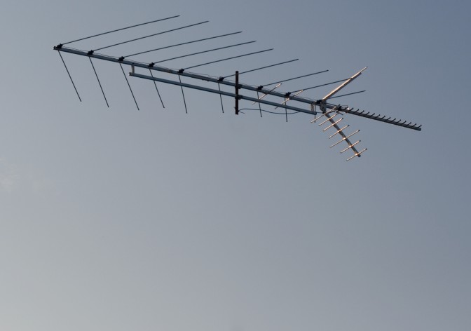
It looks fine, right? You might not even zoom in past 25%, because you’re working on a huge ten megapixel file. Then you add your wonderful contrast, and something seems astray. You might chock it up to your imagination and post your photo anyway, but little did you know the problems you’d created:

Obviously, I skipped noise reduction here for effect. But nevertheless, this is what will happen if you don’t pay attention. Blue skies are tough to edit. Everyone who tells you you can reshape bodies and clear power lines out of skies easily has no idea what they’re talking about. It’s tough work, especially if you want to get it right.
So at this point, what do you do? Go back and try it again. For blue skies, use the cloning brush with a higher hardness setting; perhaps 90%. You can see the shortcomings of the healing brush right here; it makes everything into a blurry mess, not matching the surroundings. This image has been effectively ruined for stock use. In time, you’ll learn these limitations, and working around them will be a breeze. Even then, try to avoid spot-editing by getting it right in-camera. The floating antenna wasn’t such a hot idea after all.
Even if your image looks fine on your calibrated, CRT monitor [20], it might look awful on your customers’ overly bright, uncalibrated LCD monitor, because these defects will be revealed. This is the reason to use the levels tool to over and under-expose the image: you can quickly and easily check for the invisible problems you missed.
When you edit for contrast, do whatever it takes to make the image the most appealing to your customers. This will most likely involve contrast adjustments with Curves (Ctrl + M), perhaps with a reduction in saturation (Ctrl + U). If you’re editing in an RGB color space, curves pushes the color channels as far as luminosity, which is not ideal. I’ll often reduce the saturation by 30% before using curves to counter-act this. Activate your histogram (Window > Histogram), and watch all four windows (brightness and the RGB channels). If any of them trail off to the right, you need to scale back because that channel is clipping. When the color clips, there is no detail, because it’s as saturated as it can be. While it can be artsy, for stock work, you must avoid this. The histogram in Photoshop is just as important as the histogram in your camera.
Try Image > Adjustments > Auto Contrast too. It stretches the brightness histogram across the gamut automatically, and often works quite well. Do not be afraid of automatic tools. (We were afraid of autofocus, remember?)
I recommend against sharpening, because it adds too many artifacts. If you need to sharpen, you might not be dealing with such a good image to start with. If you want to submit it anyway, you may have more luck scaling it down from twelve megapixels to six, as you’ll be more likely to escape auditing. This is wrong, because you’re actually giving a lower quality image, but it’s how the review process works.
If you’ve come here by Google, you’ve probably just read two dozen other articles about marketing your stock photos. They all tell you how afraid you have to be of being sued, that you have to take every possible precaution, you have to pay your model a big sum of money, give her a detailed explanation of the rights she’s forfeiting, act professionally, have three witnesses sign the form, check your model’s driving license in case she (or he, heaven forbid) is underage, and then make a copy of that driving license. Maybe a notary also has to be involved. Oh, and you must have your model release form reviewed by at least three lawyers before using it.
It’s all a bunch of nonsense. Just get a blanket stock release form and have your model sign it. Unless you’re shooting nudity, just ask her, “you’re not under 18, are you?” Most of the time, she’ll tell you she’s 28, proudly. I don’t know why the particular question makes women want to tell you their age so often. If she’s lying, it doesn’t matter because no one will find out.
Remember that your model release form is not to protect you; it is to protect your licensees. If you’re licensing your photos through middlemen, i.e. stock or microstock agencies, they want everything to be covered because they’re afraid of everything. It’s not to protect you, because it’s the stock agency that’s going to take the blame if one of their clients is sued. When you register with them, they’ll tell you all the liability is on your shoulders (legal protection), but this probably won’t happen even if they’re sued, because it would be bad publicity to go after a photographer. Get your models to sign a blanket release either way; it’s not too hard to do. Tell them what I wrote in this paragraph (in your own words), because it’s quite convincing.
In many of the United States’ states, you have to provide some sort of compensation to legitimize the waiver—a model release is a bonafide contract. A dollar is good if you’re feeling wealthy. I like to give six 4*6 prints of some of my best work [21] (I carry them with me). Then I say they’re worth $1.95 each; they would be if I didn’t give them away. This puts the compensation I provide above $10, which seems like a good place to be, and obviously the prints don’t cost me nearly that (nor does a copy of a music CD cost $20 to produce). Here’s an example [22] of a completed form.
Other than that, you’re good to go. Tell your model, jokingly, that she should read what she’s signing, because she’s signing all her rights away. Most people don’t even care. The 10% that raise a ruckus aren’t worth your time. I try to get a witness for signings, but if there’s none around I’ll just scribble down “N/A.” Then again, I’m not playing the stock game, so the big microstocks may not put up with that. Check with the stock agency you’re looking to work for. Many of them will provide their own model release forms for you to use, which are more convenient, though not personalized.
Keywords are important, because they are your customers prime way of finding your photos in the website’s search engine. You want to target as many relevant and unique keywords as you can, so you’ll appear to the most customers. This varies by agency, but in the backwards land of keywords, quantity often reigns over quality. Say your submitting an image like this:
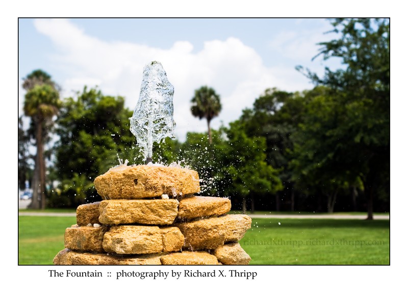
When I started out keywording my images on my deviantART gallery [23], the only thing I’d be able to think of for this photo is “water” and “fountain.” I’ve since given up keywording (so boring), but if you’re wanting to sell stock, it’s a necessary evil that you will become better at over a long, arduous journey. So what can I think of for this photo now?
water, fountain, wishing, well, wells, wish, droplets, drops, raindrops, raindrop, liquid, park, day, outdoors, splash, splashes, summer, fun, coquina, rock, rocks, pattern, texture, yellow, aqua, clean, clear, fresh, refresh, refreshing, refreshment, cool, cold, clarity, frozen, movement, fast, float, floating, speed, stream, streaming, light, bright, geyser, geiser, gush, gushing, spring, springs, burst, flow, life, wet, h2o, drink, taste, nature, shine, shiny, reflections, spatter, splatter, purity, pure
Yeah, that’s it, spam the heck out of them. Give them so many keywords, there’s no way your image won’t be seen by thousands of people, 1% of which will buy it. It’s the only way to do it.
If you’ve noticed, there is some stuff I left out. I could’ve used these:
tree, trees, forest, forests, sky, cloud, clouds, cloudy, sunshine, sun, bright, blue, skies, white, green, shade, dark, shady, grass, vivid
The reason to leave those keywords out is because they’re all describing background elements; the stuff that’s out-of-focus behind the fountain. It’s of no interest to searchers, because they can’t use the photo for those elements anyway (they’re blurry and obstructed). You never want to keyword like that, even if the off-topic stuff takes up a large section of the photo, because it’s irrelevant and of no use to your customers. Recognizing this and developing keywords, like all things in stock photography, takes time and practice. You can even pay $3 an image [24] to have a person assign photos to your keywords (I also offer this service upon special request  ). However, the point of breaking into stock photography is to make money, not to waste money, so you need to do your keywords yourself, because it’s a skill that will serve you well; I’m using them even in the tags for this blog post (editing, guides, metadata, model releases, passive income, photoshop, stock photography).
Stock photography is hard work like all else, but if you enjoy it, I can see it becoming painless and rewarding. Plus, it’s nice not to have a traditional job for once. Have fun out there.